Razor & Oak Barbershop – Barbershop Website Design
A concept website for a two-location Edmonton barbershop, designed to turn phone searches and walk-in curiosity into appointments booked with a specific barber.
Project Overview
Razor & Oak is a concept website created for a two-location barbershop in Edmonton, Alberta. The goal was to design and build a site that reflects how people actually choose a barber, and then make booking with that barber take seconds rather than a phone call.
Barbershops are a different kind of local service business. Nobody books a haircut in a panic. The decision is personal and it repeats: a client who finds the right chair comes back every four weeks for years. That changes what the website has to do. It is not trying to win an emergency search. It is trying to convince someone comparing three shops on their phone that this is the one worth trying, and then remove every reason to put the booking off.
The Problem We Designed For
Most barbershop websites stop at a logo, a phone number, and a link to Instagram. Pricing is missing or out of date. The team is a group photo with no names. Multi-location shops list two addresses in the footer and leave the visitor to work out which one is closer and whether it is open right now.
That leaves the three questions a first-time client actually has unanswered. What does a cut cost and how long will it take? Which barber is right for my hair, my beard, or my kid? Which of these two shops should I go to? Every unanswered question is a reason to close the tab and go back to Google, and a competitor with visible pricing and an online booking button collects the appointment instead.
The design challenge was to answer all three before the visitor has to ask, on a phone, without turning the page into a price list.
The Solution
We designed a booking-first homepage that moves the visitor from first impression to a confirmed appointment with a named barber, with no phone call in the middle.
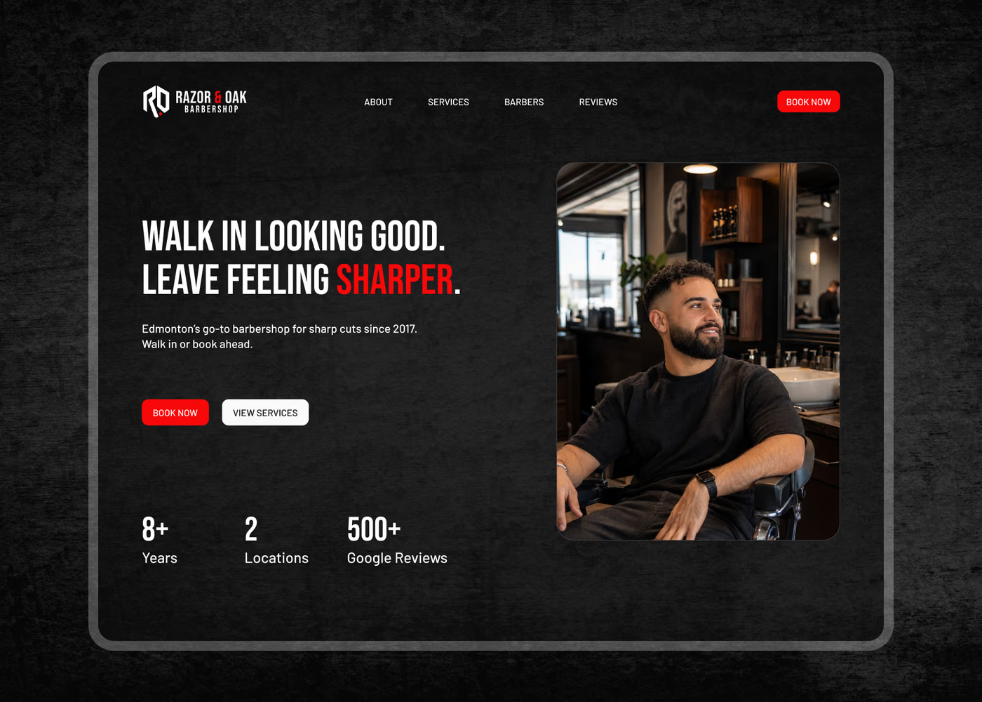
The hero states what the shop does and where it does it, pairs a primary booking CTA with a secondary services CTA, and backs it with three credibility numbers: eight years in business, two locations, and over 500 Google reviews. From there the page builds familiarity through a founder-led about section, then works through services, the crew, real cuts, reviews, and both locations before closing on a final booking CTA.
What Was Designed
- Booking-first hero with a dual CTA, a location-specific headline, and a compact trust strip of years, locations, and review volume.
- Founder-led about section that introduces Mason Brooks and the reason the shop exists, so the business feels like people rather than a storefront.
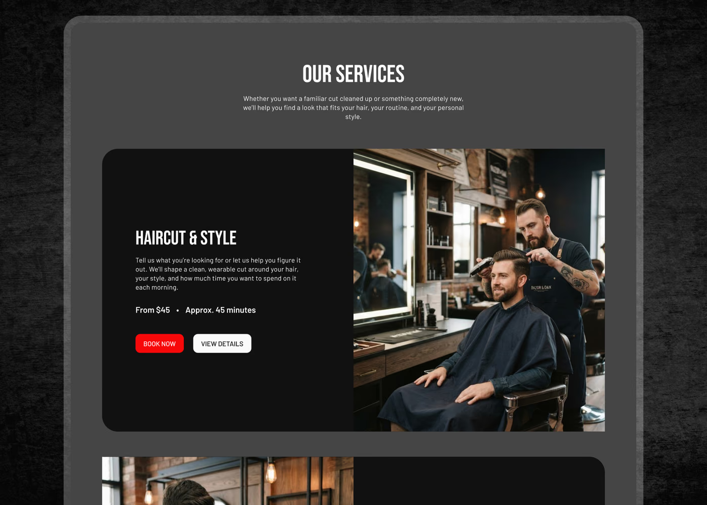
- Service cards with pricing and duration for haircuts, beard work, grooming treatments, and kids’ cuts, each with its own booking CTA and a details link for clients who want more before committing.
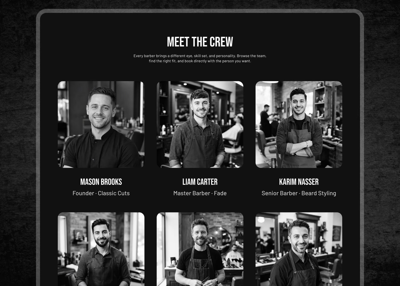
- Crew section with individual specialties — classic cuts, fades, beard styling, textured hair, modern cuts, grooming — so a visitor books the right person instead of the next open slot.
- Recent work gallery presented as a carousel of real finished cuts, doubling as a path to the shop’s Instagram.
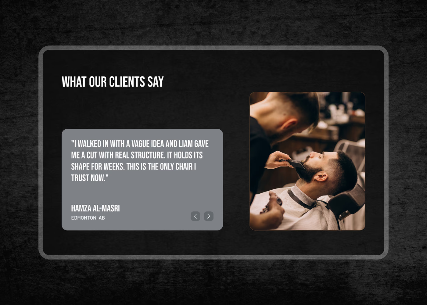
- Client testimonials written as specific, believable local scenarios rather than generic five-star quotes.
- Two full location blocks with address and per-shop hours side by side, so the visitor picks a shop instead of decoding a footer.
- Closing booking CTA that restates the three-step promise: choose the service, the barber, and the time.
Design Direction
The visual direction is dark, warm, and photography-led. Deep neutrals and warm oak tones set the tone, with generous white space between sections so a long page never feels dense.
Typography does the hierarchy work: heavy sans-serif headlines against light body copy, no decorative type, no competing accent colours. The service sections alternate image and text so the page reads as a sequence of moments in the chair rather than a grid of products, and the crew, gallery, and testimonials each sit in a carousel to keep the mobile scroll short.
The imagery matters more here than in most categories. Rather than stock barbershop shots, the page uses real service moments — a fade being blended, a straight-razor line-up, a hot towel, a client checking the finished cut. It shows the standard of work directly, which is what a first-time client is actually trying to judge.
Results & Outcomes (Concept)
While this is a concept project and not a live client engagement, the site is designed to support real business outcomes for a barbershop:
- Fewer “how much is a cut” and “how long does it take” phone calls during service hours.
- More bookings completed on the visitor’s own time, including outside opening hours.
- Barber-level demand made visible, so the shop can see which chairs fill first and staff accordingly.
- A second location that gets chosen deliberately rather than buried in the footer.
- Stronger first-time conversion from local search, where the shop is being compared side by side with two or three others.
- A content structure that extends cleanly into per-service and per-location pages as the business grows.
The project demonstrates how a personal-service business can use its website to do the reassuring work that usually happens in the first five minutes of an appointment.
Key Takeaways
Razor & Oak shows that for appointment-based businesses, conversion is mostly about removing small hesitations. Price, duration, the name of the person holding the clippers, and which door to walk through are not details to bury — they are the decision.
Nearly all of that traffic arrives on a phone, which is why the whole page was designed from the smallest screen up. That principle is covered in more depth in our guide to mobile-first web design.
If you run a barbershop, salon, studio, or any business that lives on booked appointments, let’s start a conversation.
Want a similar website for your business?
If you're a service-based business looking for a fast, modern website that is built to convert and not just look good, we can help.
Build a Site Like This