Bright Smile Dental – Healthcare Website Design
A concept website for a family dental clinic, designed to build trust, simplify appointment booking, and present dental care in a calm, approachable way.
Project Overview
Bright Smile Dental is a concept website designed for a modern family dental clinic. The goal was to build a calm, trustworthy homepage that helps patients quickly understand the clinic’s services, feel confident in the care experience, and take the next step toward booking an appointment.
Dental websites need to do more than list treatments. For most patients, choosing a dentist involves trust and comfort as much as convenience. This design was built around those decision factors, using a soft visual direction, clear content hierarchy, and approachable messaging to feel professional without feeling clinical.
The Problem We Designed For
We see this pattern often with healthcare practices. The website looks acceptable at first glance, but it does not do much work. Generic stock photography, a flat list of treatments, and a phone number buried in the footer are not enough for a patient who is still deciding whether to book.
For dental clinics specifically, the barrier is real. Many patients arrive nervous or uncertain, and the website is their first impression of the practice. When that impression does not build trust quickly, visitors leave before taking any action. The design challenge was to create a homepage that feels welcoming and credible right away, while still guiding users toward practical steps like learning about services and booking a visit.
The Solution
We designed a polished, patient-first homepage that balances warmth with professionalism. Every section has a clear role, and the overall flow is built to support the patient’s decision rather than rush it.
What Was Designed
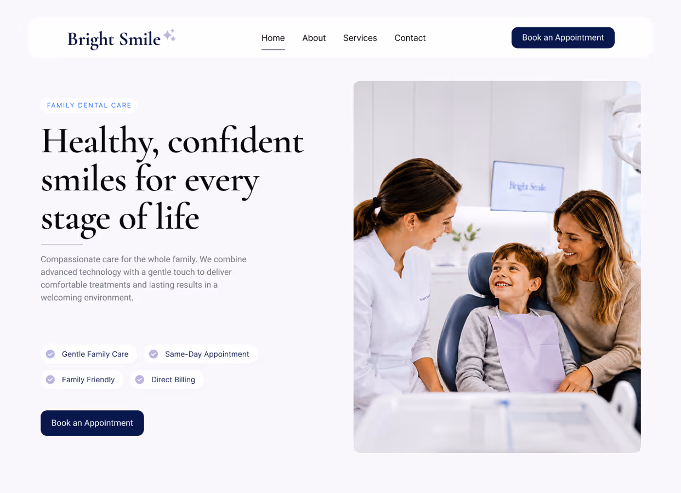
- Trust-focused hero section with a clear value message, a visible booking CTA, and warm family-oriented imagery that sets the tone immediately.
- Patient reassurance signals surfaced early in the page to address common concerns: family care, same-day appointments, direct billing, and a gentle approach to treatment.
- Clinic credibility section using simple metrics to communicate experience and patient confidence without feeling corporate.
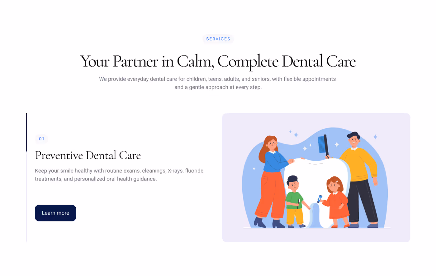
- Service overview section that makes common dental care options easy to scan, so patients quickly understand whether the clinic covers what they need.
- Patient testimonials presented in a clean, readable format to support trust through social proof.
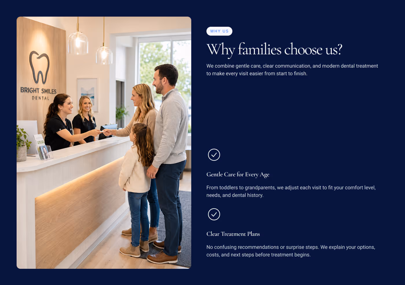
- “Why choose us” section focused on the practical benefits that matter to patients: flexible hours, clear treatment plans, and whole-family support.
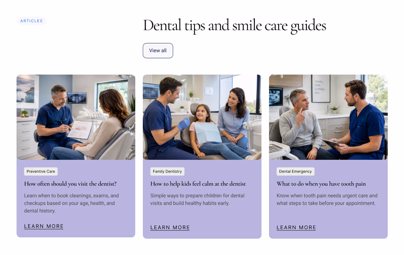
- Educational article previews that add content depth and give patients a reason to stay on the page longer.
- Final appointment CTA positioned near the bottom to convert visitors who have read through the page and are ready to act.
Design Direction
The visual system uses a soft, premium aesthetic built around calm rather than clinical. Large serif headings create warmth, while clean layout structure and compact navigation keep the page easy to use on any device.
The colour palette is anchored by gentle lavender tones, with stronger navy contrast in the CTA sections to create clear moments for action without overwhelming the softer visual system throughout the rest of the page. Real patient-style photography keeps the experience human and family-oriented. The aim was to avoid the sterile look common in healthcare design while still feeling polished and trustworthy.
Results & Outcomes (Concept)
While this is a concept project and not a live client engagement, the site is designed to support real-world outcomes for a family dental clinic:
- A stronger first impression for new patients arriving from search or word of mouth.
- A clearer, lower-friction path from homepage visit to appointment booking.
- Better communication of services, comfort, and what makes the clinic worth choosing.
- A more credible, modern online presence compared to typical local clinic websites.
- A scalable content structure that supports future service pages and SEO growth.
The project demonstrates how thoughtful visual design and clear content structure work together to reduce hesitation and make the booking decision easier for patients.
Key Takeaways
This concept reflects a core belief in how healthcare websites should work: build trust before asking for a booking. Patients need to feel comfortable with a practice before they act, and no amount of conversion optimization overcomes a first impression that feels cold or impersonal.
Every section was designed with a single purpose. The result is a homepage that feels calm, organized, and genuinely useful to someone deciding whether to call.
If your practice’s website isn’t earning that kind of trust, let’s talk about what we can build for you.
Want a similar website for your business?
If you're a service-based business looking for a fast, modern website that is built to convert and not just look good, we can help.
Build a Site Like This