Contact Form Best Practices for Service Businesses
Most service businesses lose leads at the final step. Here is how to design a contact form that removes friction and gets more submissions.

Most visitors who make it to your contact page are already interested. They found your business, read enough to decide they want to know more, and clicked through to reach out. The contact form is the last step between that interest and an actual lead.
For many service businesses, the form is where the conversion breaks down. Not because visitors change their mind, but because the form itself puts up too much resistance. Too many required fields, no phone number alternative, a submit button that says “Submit.” The fix is usually simpler than a redesign. Conversion rate optimization for a service business often starts with the contact form, because it is the highest-stakes point in the visitor journey.
What is a contact form?
A contact form is a simple way for visitors to reach out through your website. Instead of searching for an email address or making a phone call, they can send a message directly from a page on your site.
Most contact forms collect a few basic details, such as a name, email address, phone number, and a short message. Some businesses add additional fields to gather more context, but the core purpose remains the same: making it easy for someone who is interested to start a conversation.
For service businesses, the contact form often serves as the bridge between a website visitor and a potential client. It gives people a low-effort way to ask questions, request a quote, discuss a project, or learn more about your services. When designed well, it removes friction and helps turn interest into a real enquiry.
Why contact forms matter
A contact form has two jobs: helping new prospects reach out and giving existing clients an easy way to get in touch.
For prospective customers, the form is often the final conversion point on your website. Someone may spend several minutes reading about your services, reviewing testimonials, or comparing options before deciding to contact you. If reaching out feels difficult, confusing, or time-consuming, some of those visitors will leave without taking action. A simple, accessible contact form helps capture enquiries that might otherwise be lost.
For existing clients, a contact form provides a reliable communication channel when they have questions, need support, or want to discuss additional work. Not every visitor wants to pick up the phone immediately, and not everyone wants to copy an email address into their mail app. A contact form gives people a convenient option that works on any device, at any time.
The value of a contact form is not in the information it collects. Its value is in how easily it allows someone to take the next step. The easier that step feels, the more conversations your website will generate.
How many fields should a contact form have?
The relationship between form length and completion rate is straightforward: the more fields a visitor has to fill in, the fewer will finish. This applies to every form on the web, not just contact forms.
For a service business, three to five fields is a practical target. The contact form is not the place to gather a full project brief or qualify a lead before agreeing to respond. Its job is to start the conversation. Name, a way to reach the person, and a brief description of what they need gives you enough to respond meaningfully. Everything else can come in the first exchange.
If you find yourself wanting to add a sixth or seventh field because it would be useful to have that information upfront, ask whether you would still respond without it. If the answer is yes, the field does not belong on the form.
What to include and what to leave out
Most service business contact forms ask for more than they need to. These are the fields that earn their place:
- Name. First name is enough for most service businesses. Asking for a full name before any relationship exists can feel unnecessarily formal.
- Email or phone. Give visitors the choice rather than requiring both. Some people prefer email because they do not want an immediate call. Others prefer the phone because email feels slow. Forcing both removes a preference the visitor clearly has.
- A brief message. A short text area where they can describe what they are looking for. One or two sentences is genuinely enough to inform an initial response.
Fields to skip at this stage:
- Budget range. A qualification tool, not a conversation starter. Most people do not have a fixed budget in mind when they first reach out, and asking for one before any relationship exists can put people off.
- Company name and size. Relevant for enterprise services, but for most local service businesses this will come out naturally in the first conversation.
- How did you hear about us. Valuable for attribution, but it adds friction at the worst moment. Collect this in a follow-up email or CRM instead.
- Preferred appointment time or service type. Asking a visitor to make scheduling or service-type decisions before any conversation has started adds steps that have not been earned yet.
Form design that reduces friction
How a form looks and behaves affects whether people complete it. These specific design choices have a direct effect on submission rates:
- Labels above each field. Placeholder text inside the input disappears when someone starts typing, which means they have to clear the field to remember what it was asking. Labels placed above the input are always visible and are easier to read on mobile.
- Single-column layout. Stacking fields vertically removes the confusion of side-by-side inputs and scales cleanly to any screen size.
- Action-oriented submit button. A button labelled “Send My Request,” “Request a Free Quote,” or “Get in Touch” reinforces what the visitor is doing and sets a better tone than a generic “Submit.” The label is a small thing that says something about how you communicate.
- Helpful error messages. When validation fails, the message should explain what to fix (“Please enter a valid email address”) rather than just flagging an error without guidance.
- Comfortable tap targets. On a phone, fields and buttons need to be large enough to tap accurately. Small or crowded inputs are a common source of mobile abandonment, and a significant portion of your visitors are likely on a phone when they reach out.
Make your contact form easy to find
A well-designed contact form only helps if visitors can reach it. For many service businesses, the contact page is not findable quickly enough.
Contact should be a one-click action from anywhere on the site. This means a direct link in the primary navigation, or a clear “Contact” button that appears persistently in the header. Visitors who decide mid-page that they want to reach out should not have to scroll to the bottom to find the form.
Repeating the call to action in multiple places also helps. A CTA at the end of each service section, another after testimonials or project examples, and one in the footer creates multiple natural decision points rather than a single buried link. For a breakdown of where these contact touchpoints work best across a full homepage layout, see the anatomy of a high-converting homepage.
Offer more than one way to contact you
Many service business clients will not fill out a form at all. They want to call. This is especially common for trades, urgent services, or any situation where a client needs to get something scheduled quickly.
A phone number that is visible without searching for it, an email address for those who prefer asynchronous communication, and a form for 24-hour convenience together serve the full range of visitor preferences. Offering only a form removes an option from a visitor who may have been ready to call.
This is not just a preference issue. Businesses that publish their phone number clearly tend to look more accessible and accountable than those that funnel all contact through a form. A real local number is also a trust signal, particularly for Canadian service businesses where clients want to know they are dealing with a real, reachable person. The guide to high-converting small-business websites covers how visible contact information fits into the broader picture of what builds trust with local visitors.
Spam prevention without adding friction
Spam is a genuine problem for contact forms, but the solution should not create a worse problem than the one it solves.
Aggressive CAPTCHA challenges (image grids, audio puzzles, multi-step verification sequences) do block bots. They also stop some real visitors from completing the form. Every extra step at the submission stage costs some percentage of legitimate enquiries.
Two approaches handle spam without meaningful friction for real users:
- Honeypot fields. Hidden inputs that bots fill in automatically because they cannot distinguish real fields from fake ones. Real visitors never see them, and submissions where the hidden field has a value are discarded quietly.
- Cloudflare Turnstile. Challenges requests in the background based on browser signals and only presents an additional step to visitors who appear to be bots. Most legitimate users pass without seeing anything.
Either approach will stop most automated spam. For a contact form that needs to convert well, less friction is almost always the right trade-off over zero spam.
Implementation note: If you’re building a custom website, you’ll also need a way to handle form submissions, notifications, spam filtering, and storage. Services such as Formspree, Basin, or BitForward’s own form backend, Formtorch, can handle the technical side without requiring you to build a complete backend from scratch.
What happens after someone submits
The moment after a form submission is a missed opportunity on most service business websites. The visitor has taken the action. What they see next shapes whether they feel confident about the next step or uncertain about whether anything happened.
A confirmation page is better than a toast notification or a simple banner. It gives the visitor somewhere to land, confirms receipt, and lets you set expectations for the response. A message along the lines of “We will review your message and get back to you within one business day, usually sooner” does three things at once: it confirms the submission worked, gives a realistic timeframe, and removes the anxiety of not knowing whether anything happened.
The confirmation page is also a natural place to describe what the next step looks like. If the typical response is a short call to discuss the project, say so. If they will receive an email with a few questions first, say that. Visitors who know what to expect are more likely to stay engaged while they wait.
Response speed matters on its own terms. A lead who hears back within a few hours is in a meaningfully different position than one who waits several days. For most local service businesses, same-day responses are realistic and make a real difference in how many initial enquiries turn into clients.
Common contact form mistakes
These are the most frequent problems that reduce contact form submissions for service businesses:
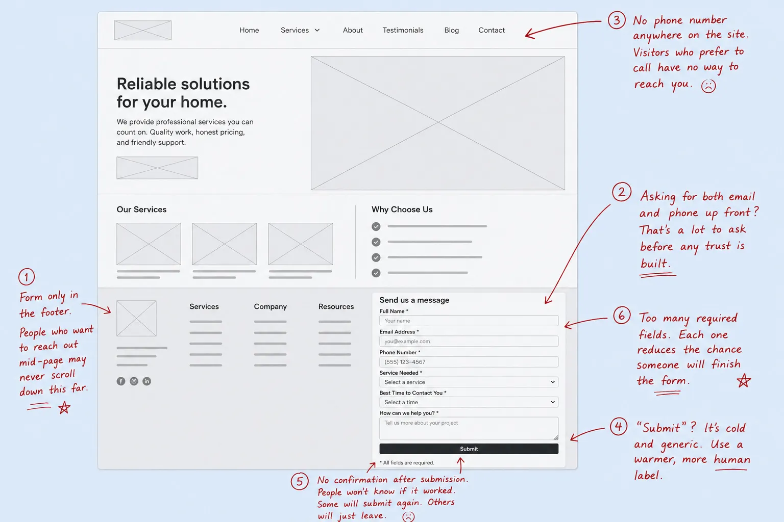
- Form only in the footer. Visitors who decide mid-page that they want to reach out will not always scroll to the bottom to find it. If that is the only place the form appears, you are losing people who were already ready to contact you.
- Requiring both email and phone. Asking for both before any relationship is established forces visitors to share more than they may want to, which causes some of them to leave without submitting.
- No phone number anywhere on the site. For visitors who prefer to call, a form-only contact experience removes the option entirely. Many local service clients specifically want to speak with someone before committing.
- A “Submit” button label. The word describes a server action, not a conversation. A direct, specific label always reads better.
- No confirmation after submission. Visitors who submit a form and see nothing in response do not know whether it worked. Some will submit again. Others will simply leave, unsure.
- Too many required fields. Each additional required field reduces the number of people who complete the form, even when the information would be useful.
Frequently asked questions
How many contact form fields is too many?
For most service businesses, more than five required fields is too many. Name, a contact method, and a brief message are enough to give a meaningful initial response. Additional fields should only be added if the form cannot serve its purpose without them. See our FAQ for answers to other common questions about websites and lead generation.
Should I ask for a budget range on my contact form?
Not as a required field, and usually not at this stage at all. Many people who reach out through a contact form do not have a specific number in mind yet, and asking for one before any context exists can feel premature. Budget discussions tend to go better in conversation once there is some understanding of the project.
What should my submit button say?
Something that reflects the action the visitor is taking and the tone you want to set. “Send My Request,” “Request a Free Quote,” “Get in Touch,” and “Start the Conversation” all work better than “Submit” because they describe the outcome rather than the mechanism. Keep it short and specific to your offer.
What should a contact form confirmation message include?
Three things: confirmation that the submission was received, the expected response time, and what the next step looks like. A message along the lines of “Thanks for reaching out. We will review your message and get back to you within one business day” covers all three without being wordy.
Why is my contact form not getting any submissions?
The most common causes are too many required fields, a form that is hard to find on the page, no phone number alternative for visitors who prefer to call, a submit button that does not build confidence, and a form that does not work well on mobile. Working through the common mistakes section above usually identifies the issue. For a broader look at why a website may not be converting visitors into leads, our post on why your website gets traffic but no leads covers the full range of conversion problems beyond the form itself.
The contact form is the last step between a visitor who is interested and a lead you can actually work with. Most of the changes that move the needle are not complicated. Fewer required fields, a visible phone number, clear placement, and a confirmation page that sets expectations will improve almost any contact form.
If your website is getting traffic but not generating enough enquiries, the form is a good place to start. For a broader look at what is holding your site back, our conversion optimization service is built for service businesses in exactly that position. If you would prefer an outside review first, a free website audit covers the main conversion, performance, and technical factors and shows you where the biggest opportunities are.