Trust Signals That Convert Visitors Into Leads
Service business visitors don't convert because they don't trust you yet. Here are the trust signals that actually move the needle.

Plenty of service business websites look the way a website is supposed to look. Clean layout, professional photos, a clear list of services. But the contact form stays quiet.
The gap between a website that looks credible and one that converts visitors into leads is almost always trust. Not the kind you build over time through a client relationship, but the kind a first-time visitor decides to extend in a matter of seconds, based almost entirely on what they see. Trust signals are the specific elements on your website that make that decision easier.
This post covers what trust signals are, which ones work hardest for service businesses, where to place them, and what to avoid. If your website is getting traffic but not generating the leads you expect, trust is usually the first place to look.
What are trust signals?
A trust signal is any element on your website that gives a first-time visitor evidence that your business is real, capable, and safe to hire. Not a feeling you project through copy, but evidence they can independently verify or cross-reference.
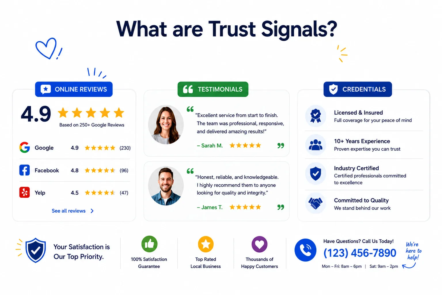
The distinction matters because visitors are skeptical by default. A claim you make about your own business, no matter how confidently it is written, carries less weight than a claim made by someone with no stake in the outcome. “We deliver exceptional results” is a marketing line. A named client review that says “They rebuilt our front walk in two days and it held up through the entire winter” is evidence.
Trust signals are the difference between a visitor taking your word for it and a visitor having a reason to believe you.
Why trust signals matter more for service businesses
The stakes of a service business transaction are different from ordering a product online. When someone hires a trades contractor, a dental clinic, a financial advisor, or a web design studio, they are not buying an object they can return if it does not work out. They are inviting someone into their home, their office, or their finances. They are trusting a business with something that matters.
That elevated personal risk means that trust is not a nice-to-have element of your website. It is the prerequisite for conversion. Visitors who cannot answer “Can I trust these people?” will not contact you, regardless of how good your pricing or services look.
This is why the visitor questions covered in the anatomy of a high-converting homepage include trust as the third question every visitor asks, right after understanding what you do and whether it is relevant to them. By the time someone reaches your contact page, they have already decided whether they trust you enough to reach out. The trust signals on the pages before that decision are what get them there.
The trust signals that work for service businesses
Not all trust signals carry equal weight, and some that work well for e-commerce are much less relevant for local service businesses. These are the ones that consistently move the needle.
Real reviews from third-party platforms
Customer reviews from Google, Yelp, or industry-specific directories are the most powerful trust signal on a service business website. The reason is simple: visitors know they are harder to fabricate than self-hosted testimonials. A widget pulling live reviews from your Google Business Profile is more credible than a testimonials section with quotes copied to a page you control, because the original source is verifiable.
What makes a review actually persuasive is specificity. A review that says “Great service, highly recommend” tells a potential client very little. A review that says “Had our basement waterproofed in late October, they showed up on time, finished ahead of schedule, and the crew was respectful of our home” gives a visitor something real to evaluate. The more specific the outcome, the more a reader can project their own situation onto it.
For a practical guide to building your review base, see our post on how to get more Google reviews.
A visible phone number
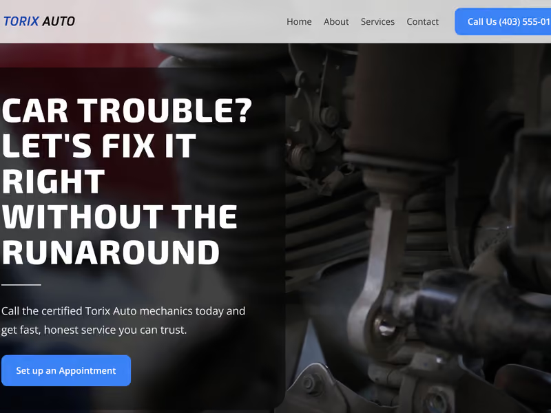
A real, local phone number displayed in your site header is not just a contact option. It is a trust signal.
Service businesses that funnel all contact through a form, with no phone number visible, look less accountable. Visitors who are comparing two businesses and see a phone number on one site and only a form on the other will often register the difference without being able to articulate why. The phone number communicates: a real person runs this business, and they are willing to be reached.
This matters especially for trades, urgent services, or any work where a client needs to get something scheduled quickly. A local number (not toll-free only) also signals genuine local presence. If a visitor is looking for someone in their area, a Calgary prefix is meaningful information on its own.
For more on how visible contact information affects conversion at the page level, see our post on contact form best practices for service businesses.
Real photos of your team and work
Stock photography actively undermines trust for service businesses. Visitors have seen the same stock images on dozens of sites: the diverse team shaking hands in a conference room, the contractor in a hard hat who is clearly a model, the smiling receptionist in a clinic that looks too pristine. These images do not make your business look professional. They make it look like a template.
One genuine photo of your actual crew at a job site, your real workshop, or a finished project in progress does more work than any number of polished stock images. Visitors want to know what they are getting. Authentic imagery answers that question before anyone reads a word.
This principle carries through to every service business context. When BitForward designed the Bright Smile Dental concept, real-feeling imagery was central to the trust the studio aimed to build on behalf of the clinic. Patients deciding on dental care need to visualize themselves in the space and trust the people they will meet. See the Bright Smile Dental case study for how that translates into design decisions.
The same logic applies in higher-stakes financial contexts. The Winslow Wealth Advisory case study shows how visual presentation and authentic editorial photography communicate the level of professionalism that wealth management clients require before they will share their financial picture with someone.
Professional, consistent design
Design quality is a proxy for operational quality. Visitors cannot easily evaluate whether your work is actually good before they hire you, so they use the quality of your presentation as a signal. An inconsistent, outdated, or visually cluttered website raises a quiet question before the visitor has consciously formed it: if this business does not invest in how they present themselves, will they invest in my project?
This is not about having a visually impressive website. It is about visual consistency, readable typography, pages that load without errors, and a presentation that does not look neglected. A copyright year that is two years out of date in your footer, broken image placeholders, or fonts that vary by page all signal that the site has not been maintained. That translates directly into reduced confidence in the business behind it.
Industry credentials and affiliations
Business licenses, insurance proof, professional association memberships, and trade certifications answer the question “Are they legitimate?” in a way no marketing copy can. Not every visitor looks for them actively, but visitors who are seriously evaluating two or three options, particularly for higher-ticket or higher-risk services, often will.
The placement matters as much as having them. Credentials buried deep in an about page help fewer visitors than the same information placed in the footer (where it appears on every page) or mentioned in the hero section for services where licensing is a buying factor. A contractor’s license number, a BBB accreditation logo, or a professional association seal should be visible without requiring a specific search.
Guarantees and risk reversal
A satisfaction guarantee shifts the risk from the buyer to the seller. It removes a layer of hesitation that many visitors carry without even being aware of it: “What if I pay for this and it does not work out?”
A straightforward guarantee does not need to be complicated. “If you are not satisfied with the work, we will come back and make it right” is enough to remove a concern that might otherwise prevent someone from reaching out. The guarantee belongs near your calls to action, where hesitation is highest, not buried in a terms page the visitor has to find.
For higher-ticket services, a guarantee is not just a nice-to-have. It is a competitive differentiator. Most service businesses do not offer one, which means yours will stand out.
Security indicators
An SSL certificate, visible as the padlock in the browser address bar and the HTTPS in your URL, is now the minimum baseline for any business website. Modern browsers flag HTTP sites as “Not Secure” directly in the address bar. That warning alone erases conversion at the first moment of contact.
Beyond the technical baseline, a brief note near your contact form adds visible reassurance: “Your information is kept private and never shared.” Visitors submitting a form are sharing personal information. A single line confirming that information is handled responsibly removes a hesitation point that is easy to overlook from the business side and quite real from the visitor’s side.
Testimonials with context, not just stars
A star rating by itself says little. A testimonial that includes the client’s business type, the problem they had, and the specific outcome they experienced says a great deal. “5 stars” does not tell a visitor much. “We had a paving company redo our entire commercial lot in two phases to keep the business running during construction, and it came in under the original estimate” tells a visitor who runs a commercial property exactly what they need to hear.
The more a testimonial speaks to the situation of your likely next client, the more work it does. This means thinking about placement, not just collection. A testimonial from a dental patient belongs on a dental service page. A testimonial from a commercial client belongs on the commercial services section. Context-matched testimonials are significantly more persuasive than a generic testimonials page.
Where to place trust signals
Having trust signals is only half the answer. Placing them where visitors actually need them is the other half.
Your homepage is where most visitors form their first impression. The strongest social proof, a star rating with a review count or a brief client quote, belongs above the fold or immediately below the hero section. Testimonials work mid-page. Credentials and certifications belong in the footer, where they appear site-wide.
Service pages are where visitors evaluate whether to actually hire you for a specific service. Place testimonials and case studies next to the relevant service description, not on a separate testimonials page. A review from a client who had work done that matches what the visitor is considering is far more persuasive in that context than the same review sitting on a standalone page.
Your contact page is the highest-friction moment on your site. A visitor reaching your contact page has already decided they are interested. What they need at that moment is reassurance that reaching out is the right call. A brief testimonial near the form, your response time, and a privacy note next to the submit button all reduce the hesitation that can cost you a submission at the last step. The details of what makes a contact page convert well are covered in our post on contact form best practices for service businesses.
Your about page is where visitors who are further along in their evaluation look for the human side. Team photos, your background, credentials, and company story live here. Visitors who reach the about page are genuinely interested and looking for reasons to confirm that decision.
What to avoid
Some trust signals are worth using carefully, or not at all.
- Badges from organizations your audience has never heard of. A seal from an obscure “verified business” directory that your visitors have no frame of reference for does not build trust. It raises a question instead. Use badges from organizations your specific clients recognize: the Better Business Bureau, relevant trade associations, professional certification bodies in your field.
- Testimonials without attribution. A quote from “S.M., Calgary” reads as suspect to most visitors. Full name, business type, and a photo when possible. The more verifiable a testimonial looks, the more work it does.
- Too many badges in one place. A wall of certification seals, payment icons, and trust logos looks less trustworthy than a clean page with a few credible signals placed thoughtfully. Three to five, placed at relevant decision points, outperform a cluttered badge section every time.
- Generic stock photography. If you do not yet have real photos to use, a clean, minimal design with no people imagery is better than recognizable stock. Visitors are more forgiving of absence than they are of artificiality.
Frequently asked questions
What is the most important trust signal for a service business?
Real client reviews from third-party platforms like Google. They are independently verified, visitors trust them more than self-hosted testimonials, and they answer the most important question a potential client has: “Are these people actually any good?” Third-party reviews cannot easily be faked in the same way a testimonials page can, which is precisely what makes them credible.
Where should trust signals appear on a website?
At every decision point: next to your call to action, on service pages alongside the service description, on your contact page near the form, and above the fold on your homepage. The most common mistake is grouping all trust signals on a dedicated testimonials page that most visitors never visit. Trust signals need to appear where decisions are being made.
Do I need professional photography to build trust?
You need real photography. Professional quality is an advantage, but a genuine image of your actual team or a real project you have completed is more credible than a perfectly lit stock photo of people who have nothing to do with your business. A real team photo near a contact form consistently outperforms generic imagery. If you are not ready for a professional shoot, a clean phone photo of your actual crew or workspace is a better starting point than stock.
How many Google reviews do I need before they become a meaningful trust signal?
Even three to five detailed, specific reviews carry real weight. What matters more than the total count is how specific and recent they are. Five reviews from the past six months tell a visitor more than fifteen reviews with the most recent one from three years ago. Start building reviews consistently rather than waiting to reach a particular number. For strategies to collect more reviews without pressure tactics, see our post on how to get more Google reviews.
Does website design quality affect how much visitors trust a business?
Significantly. Visitors form an impression of a site’s credibility in the first few seconds, before reading a single word of content. A visually inconsistent, cluttered, or dated design creates ambient doubt about the business’s operational quality, because people reasonably infer that a business that does not invest in its own presentation may not invest in client work either. Professional, consistent design is not separate from your trust strategy. It is part of it.
Trust signals compound. One good review helps. A site with specific reviews, a visible phone number, real team photos, visible credentials, and a professional presentation creates a cumulative effect that is much harder for a visitor to dismiss. Each signal answers a different version of “Can I trust these people?” and the combination leaves fewer reasons to hesitate.
The place to start is almost always reviews and contact visibility. Both are free to implement, both carry disproportionate weight, and both address the most common trust gaps on service business websites.
For a broader look at how trust fits into the full conversion picture, see our post on conversion rate optimization for service businesses. If you want an outside perspective on where your site stands, a free website audit covers the main conversion, trust, and performance factors together. Or if you are ready to build trust into your site from the foundation up, our conversion optimization service is built for service businesses in exactly that position.